


Behind The Scenes
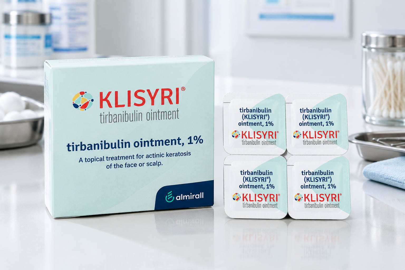
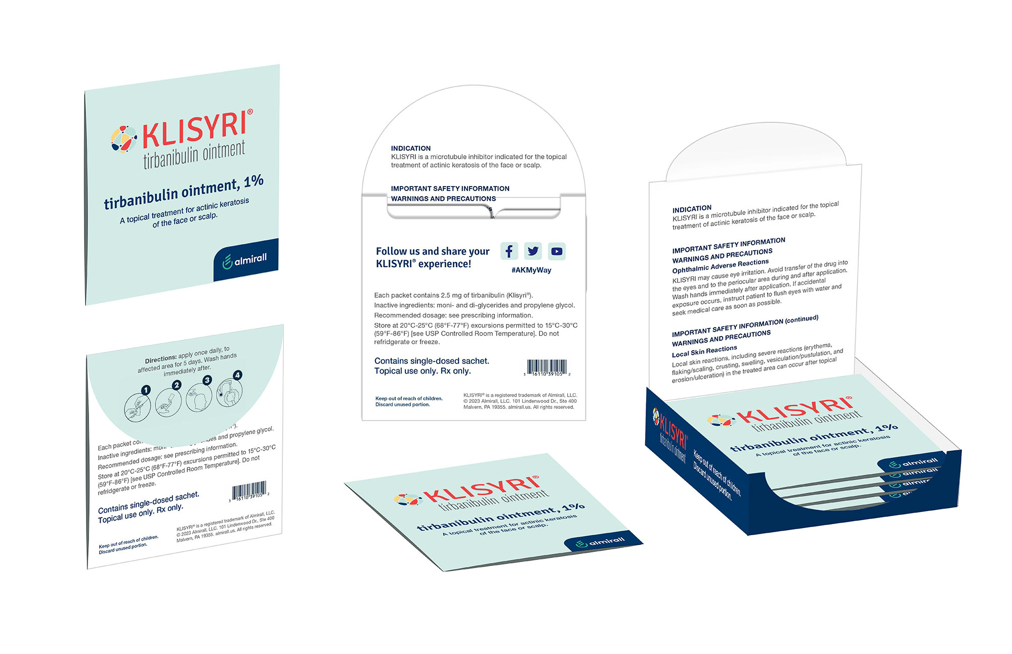
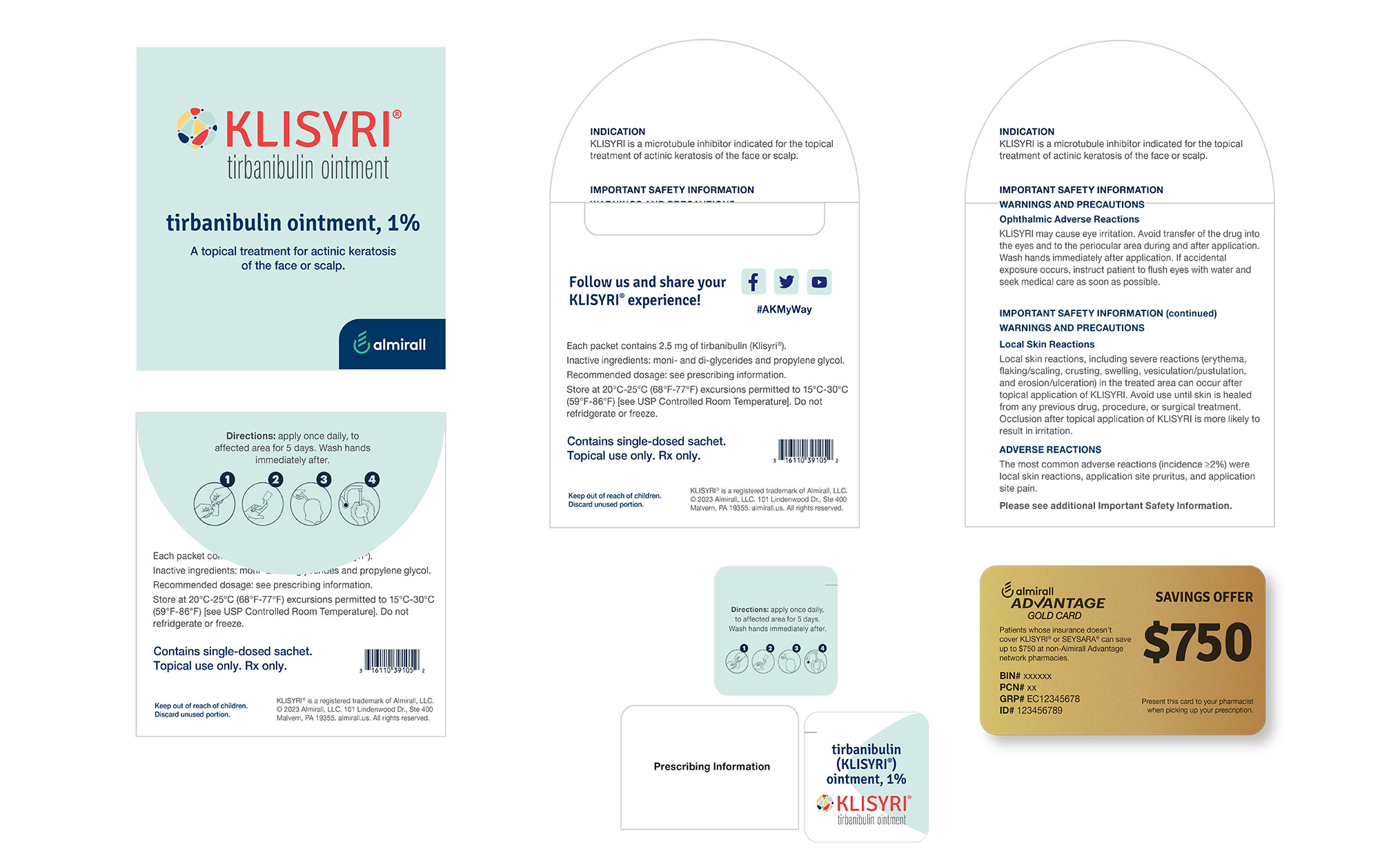
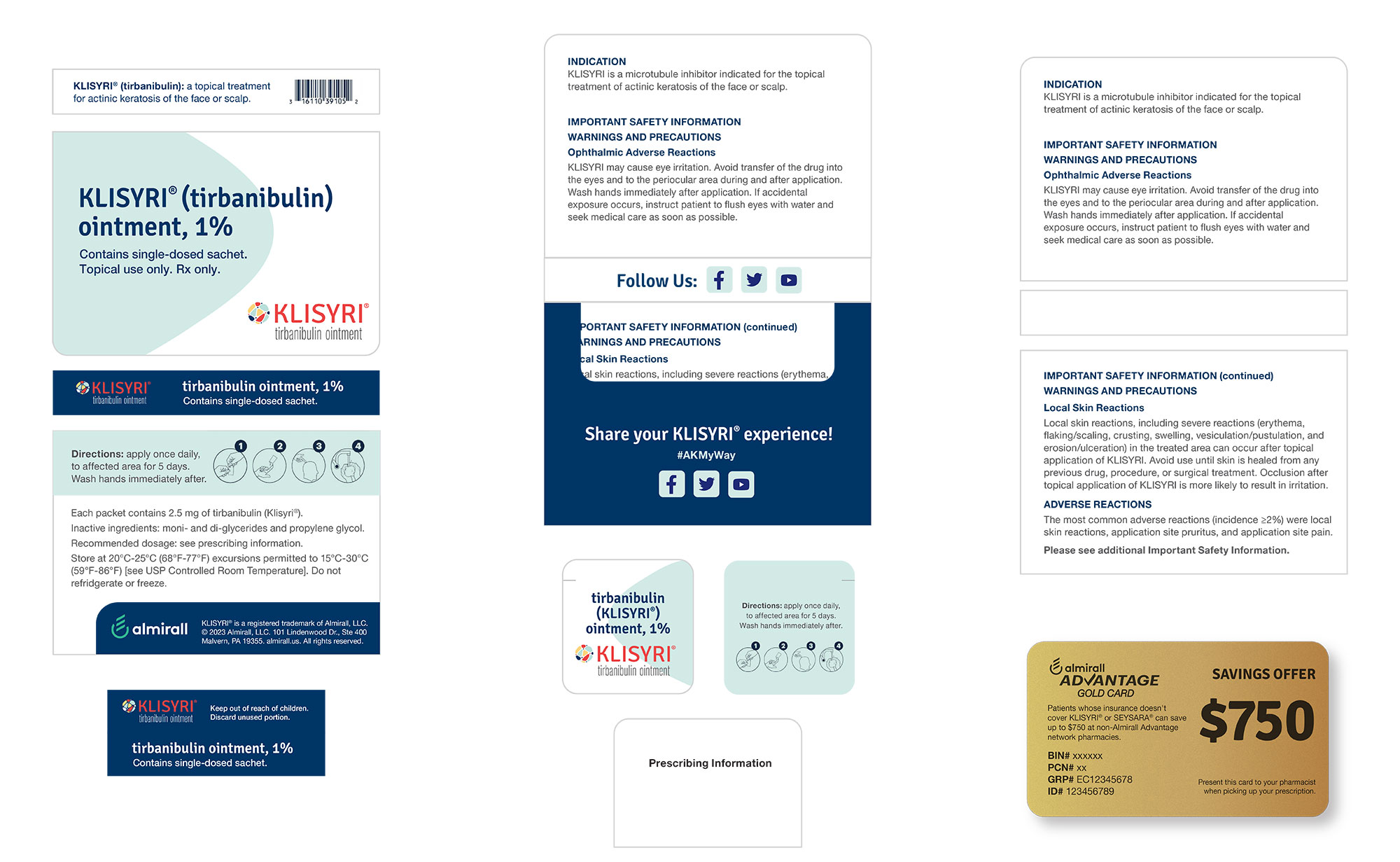
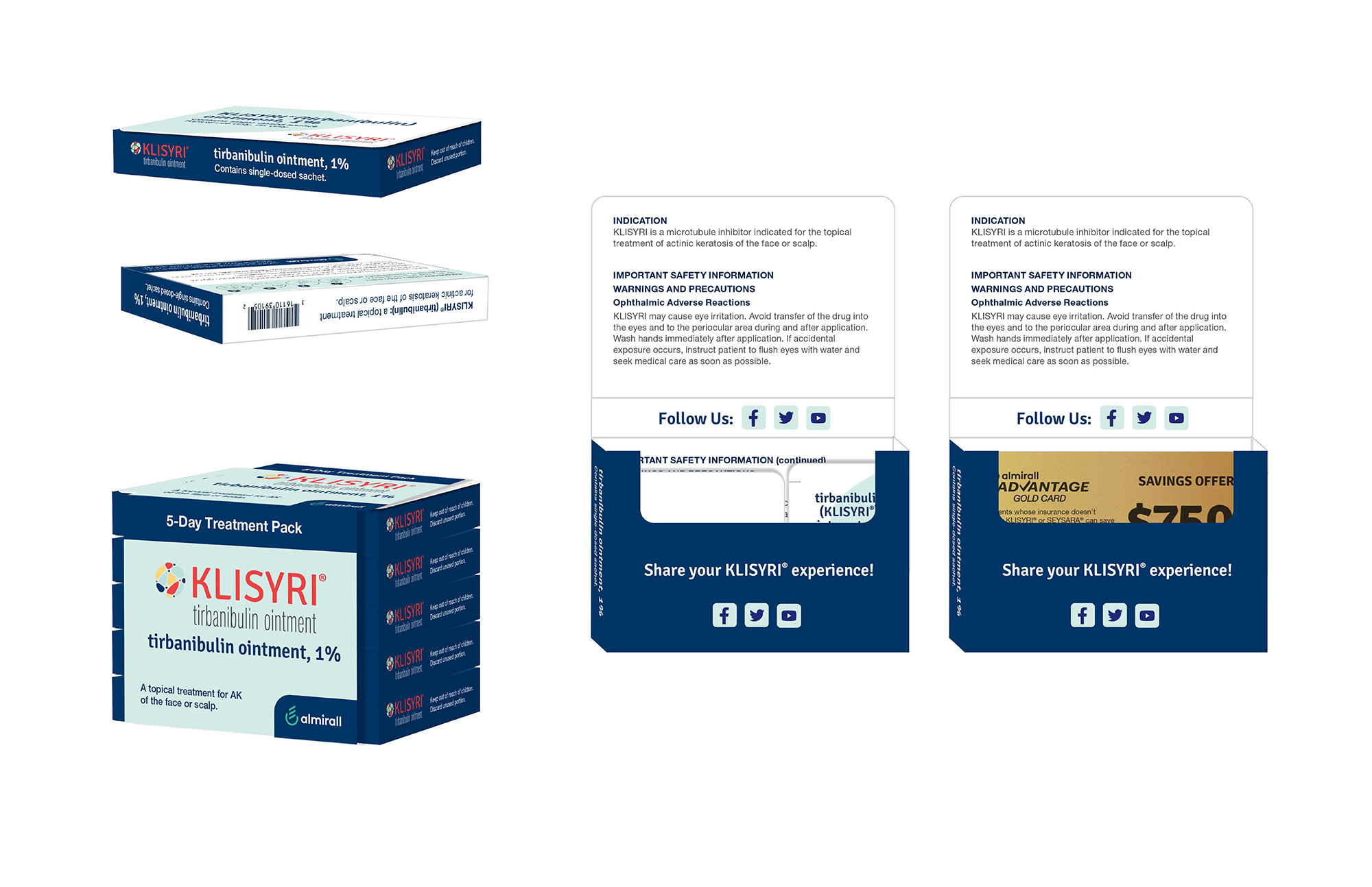
Designing for a cutting-edge dosing launch meant taking a clinical, complex medical routine and transforming it into a seamless, foolproof user experience. The challenge was clear: strip away the anxiety of topical dosing and replace it with absolute packaging clarity.
We stripped the layout down to its absolute essentials, deploying an ultra-clean, high-contrast visual system that anchors the brand's sophisticated identity. By engineering intuitive, pre-measured daily dose packets within a stark, structural layout, the packaging design turns a rigorous 5-day medical treatment into a flawless, step-by-step user journey. Every tear, every packet, and every typographic indicator was meticulously placed to enforce operational precision—proving that high-end healthcare design can be both visually striking and life-savingly simple.